Google Ads Dashboard
Project Overview
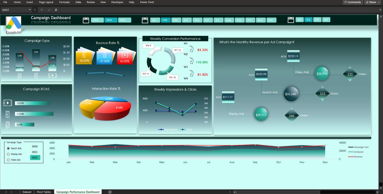
This interactive Google ads dashboard incorporates a variety of chart types that effectively convey the underlying campaign data message to all users who engage with it. It features a selection of combo, line, bar, column, pie, and area charts, collectively creating a visually engaging data visualization environment. The comprehensive analysis of this data yields direct and actionable insights for the users, enabling informed decision-making and strategic outcomes.
- Trebuchet MS
- Century Gothic
#F6F8FC
#97BFC6
#1B4A56
# 00221C
# CDFFF7
Excel Workbook (.xlsx)
341 KB
What's Included
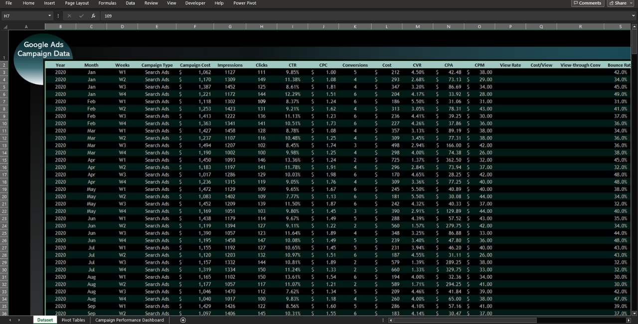
- Dataset
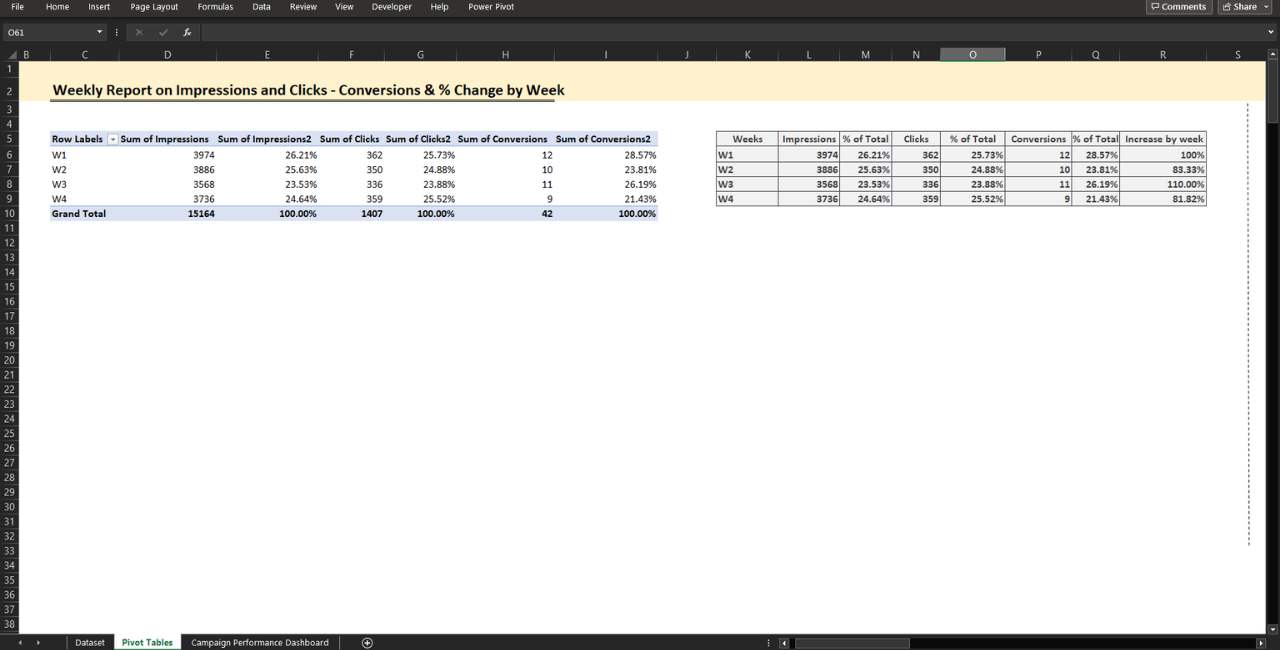
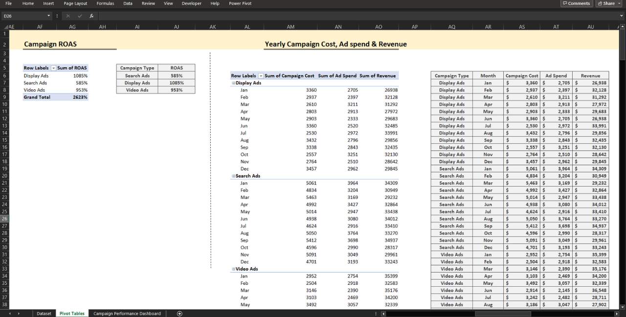
- Pivot Tables
- Dashboard
- The dashboard presents a combo chart that displays the Click-Through Rate (CTR) and Conversion Rate (CVR) for each campaign in a stacked column format. Additionally, the Cost per Click (CPC) is shown as a line chart.
- The campaign’s Return on Ad Spend (ROAS) is depicted using a clustered bar chart.
- Visual representations include a line chart for bounce rate and a 3-D pie chart for interaction rate across campaigns.
- Conversion performance is highlighted with a doughnut chart, reflecting weekly positive or negative changes in percentage difference.
- Performance of weekly impressions and clicks is captured through line charts.
- Monthly revenue per ad group is assessed using a scatter chart, featuring distinct bubble colors to emphasize the highest value. Data on average order value and order number for the same campaign are also available.
- For campaign cost, ad spend, and revenue, a combo chart is utilized. While cost and ad spend employ an area chart, revenue is portrayed with a line chart.
- Pivot tables & Formulas
- Interactive Dashboard
- Option Button (Form Control)
- No VBA/macros


