
Web Analytics Dashboard
Project Overview
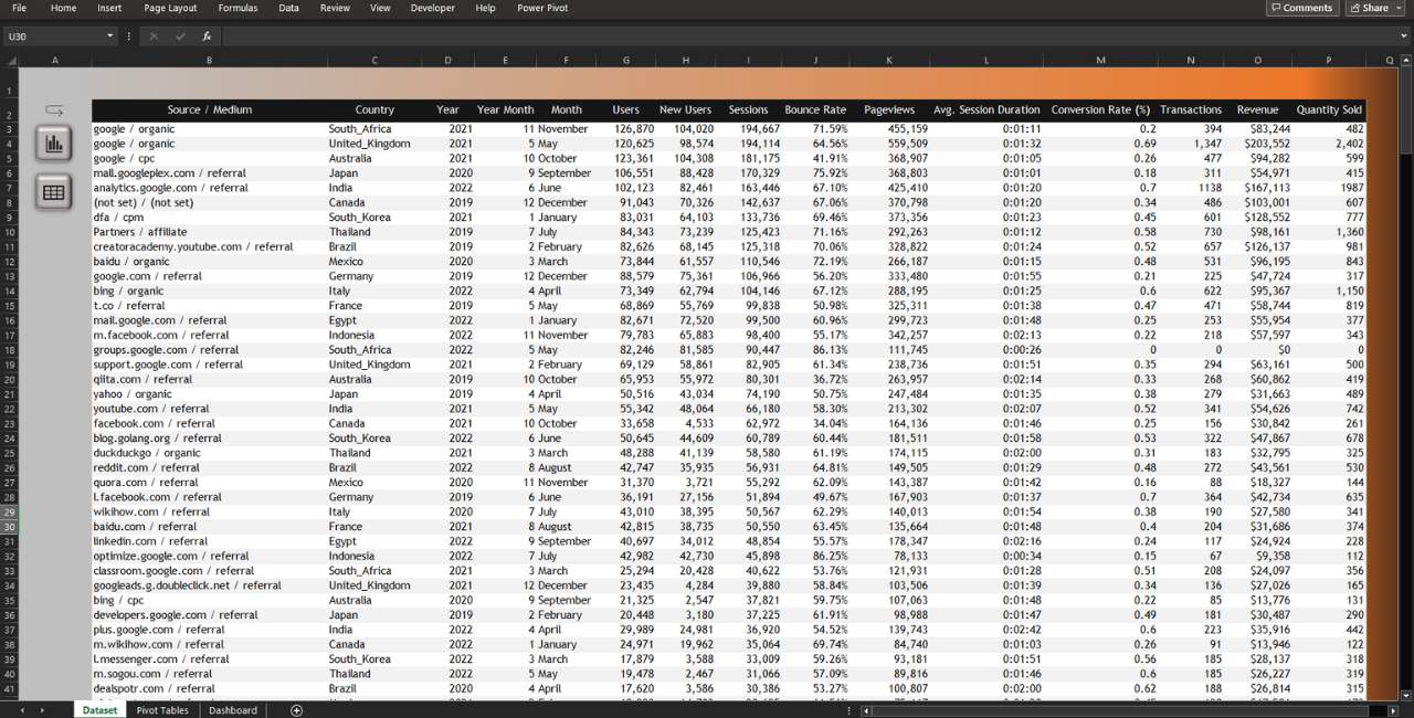
The website analytics dashboard is meticulously designed to present data in a visually engaging format, offering to the user a complete and insightful overview of the company’s website performance across critical areas. This level of comprehensiveness is achieved through the strategic incorporation of various graphical representations, such as column, line, and area charts, which serve as powerful tools for highlighting key metrics and trends.
One noteworthy feature of this dashboard is its dynamic functionality, which enhances user experience and data exploration. By seamlessly integrating the slicer feature, users can effortlessly customize the displayed data by selecting their desired year. This adaptability ensures that the dashboard remains highly relevant and responsive to the specific informational needs of users, empowering them to make informed decisions and gain deeper insights into website performance.
- Trebuchet MS
- Century Gothic
#EC7728
#BFBFBF
#060B14
#161616
Excel Workbook (.xlsx)
14.7 MB
What's Included
- Dataset
- Pivot Tables
- Dashboard
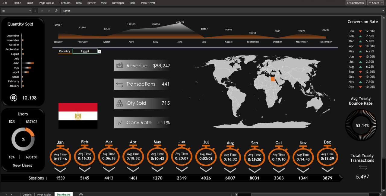
- Display monthly revenue by year using an area chart, including data labels.
- Present monthly and total quantity sold per year in a bar chart with a preset 3D effect.
- Use a pie chart to compare user percentage and numbers, including new users with a 3D effect.
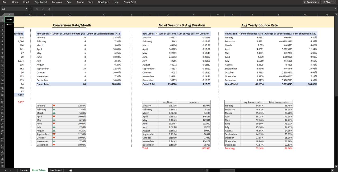
- Highlight conversion rates by month in a table, using green and red arrows for conditional formatting.
- Showcase average yearly bounce rate in a combo doughnut chart, presenting actual and 100% bounce rate data.
- Embed average session time per month with a timer icon and corresponding session count.
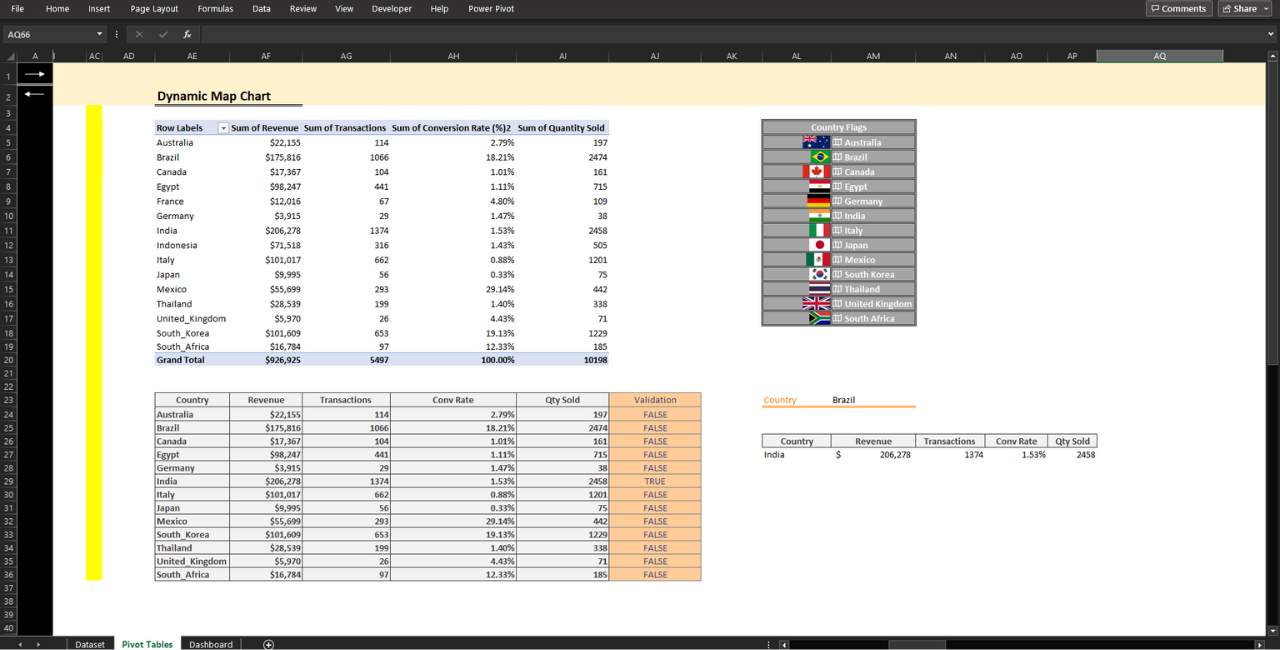
- Utilize a Bing dynamic map chart to showcase global statistics by country. Users can choose countries from a dropdown list, changing the flag accordingly.
- Pivot tables & Formulas
- Drop-down list
- Interactive Navigation Buttons
- No VBA macros
